

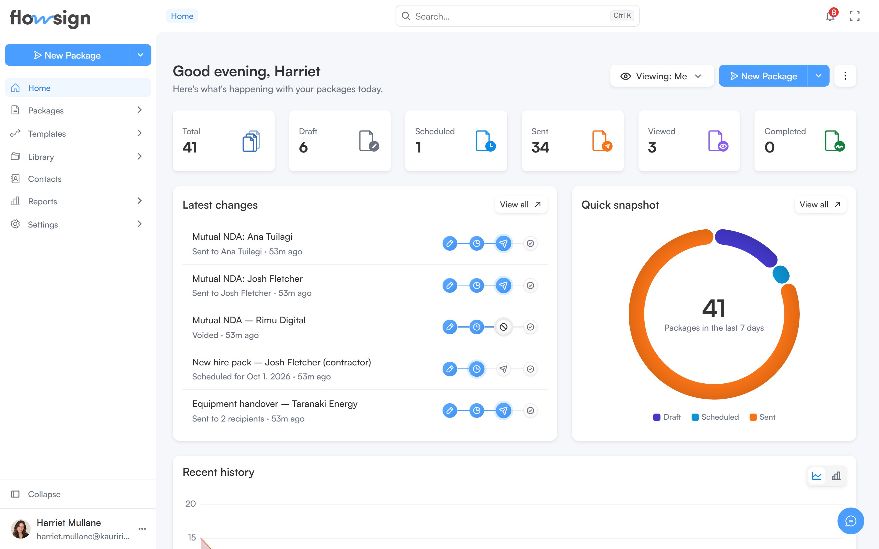
Home, with package stats across the top and recent activity below.
Banner
A banner introduces Flowsign with an Explore Flowsign button that opens the product walkthrough dialog. You can dismiss the banner, and it stays hidden after that.Greeting row
Below the banner, a greeting shows your first name alongside these actions:- A Viewing control, shown only if your role has the
canViewAllPackagespermission (see Viewing your team’s packages). - The New Package split button, which opens the package creator. Its menu also offers Send from Template and Create Template when your role allows them. It only appears if your role has the
canSendPackagespermission. - A kebab menu of dashboard options (see below).
Viewing your team’s packages
If your role hascanViewAllPackages, the Viewing control lets you choose whose packages Home summarises. Under Show packages from, pick Me, Specific team members, Member group or Everyone. The stats, latest changes, quick snapshot and recent history all follow your choice.
Set as my default saves the current choice, so Home and the packages lists open on it next time. Once saved, the button reads This is your default view.
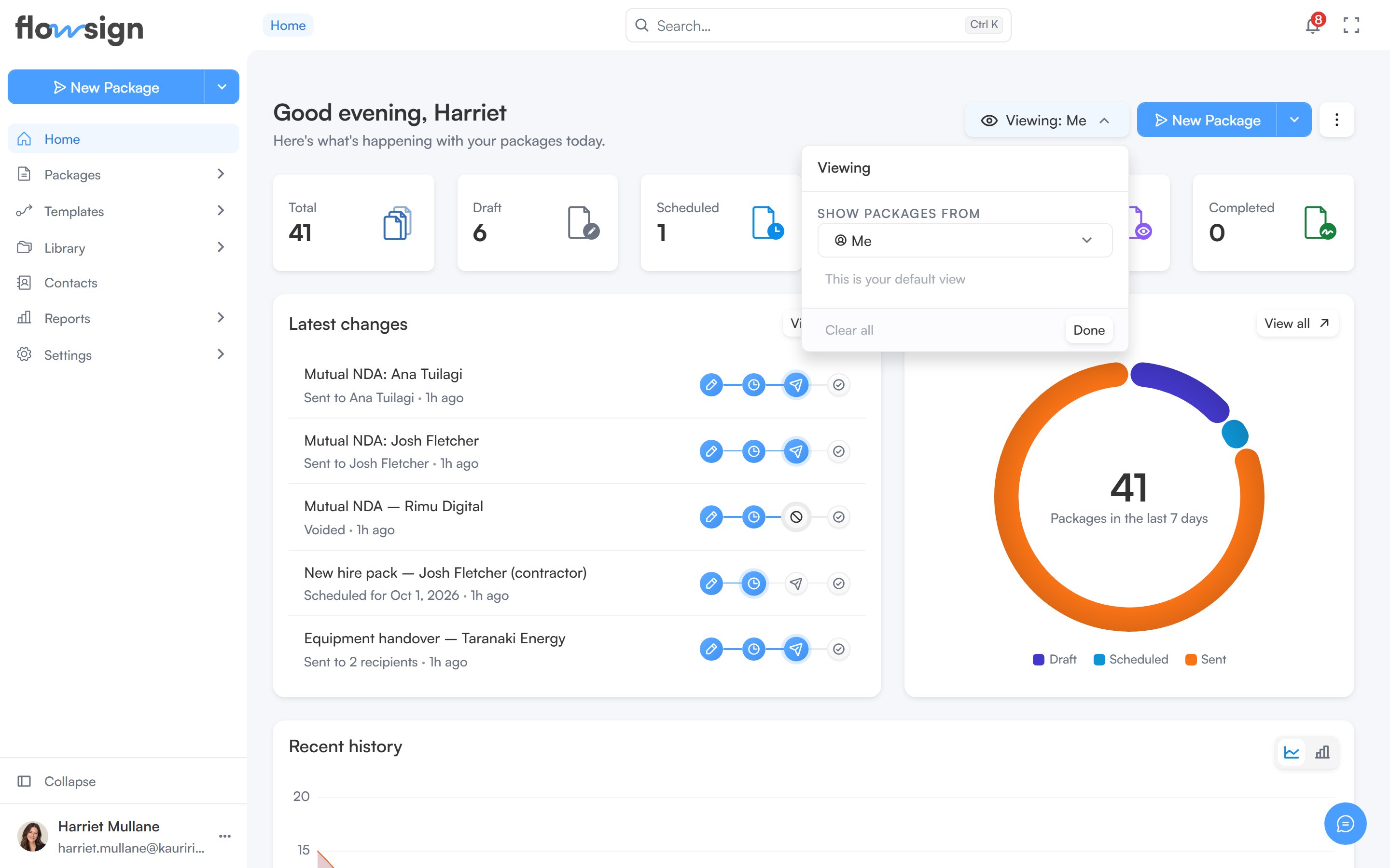
The Viewing control, open to choose whose packages Home summarises.
Search
The search box in the header (or Ctrl K / Cmd K) opens a command palette to jump to a page, a package or a help guide.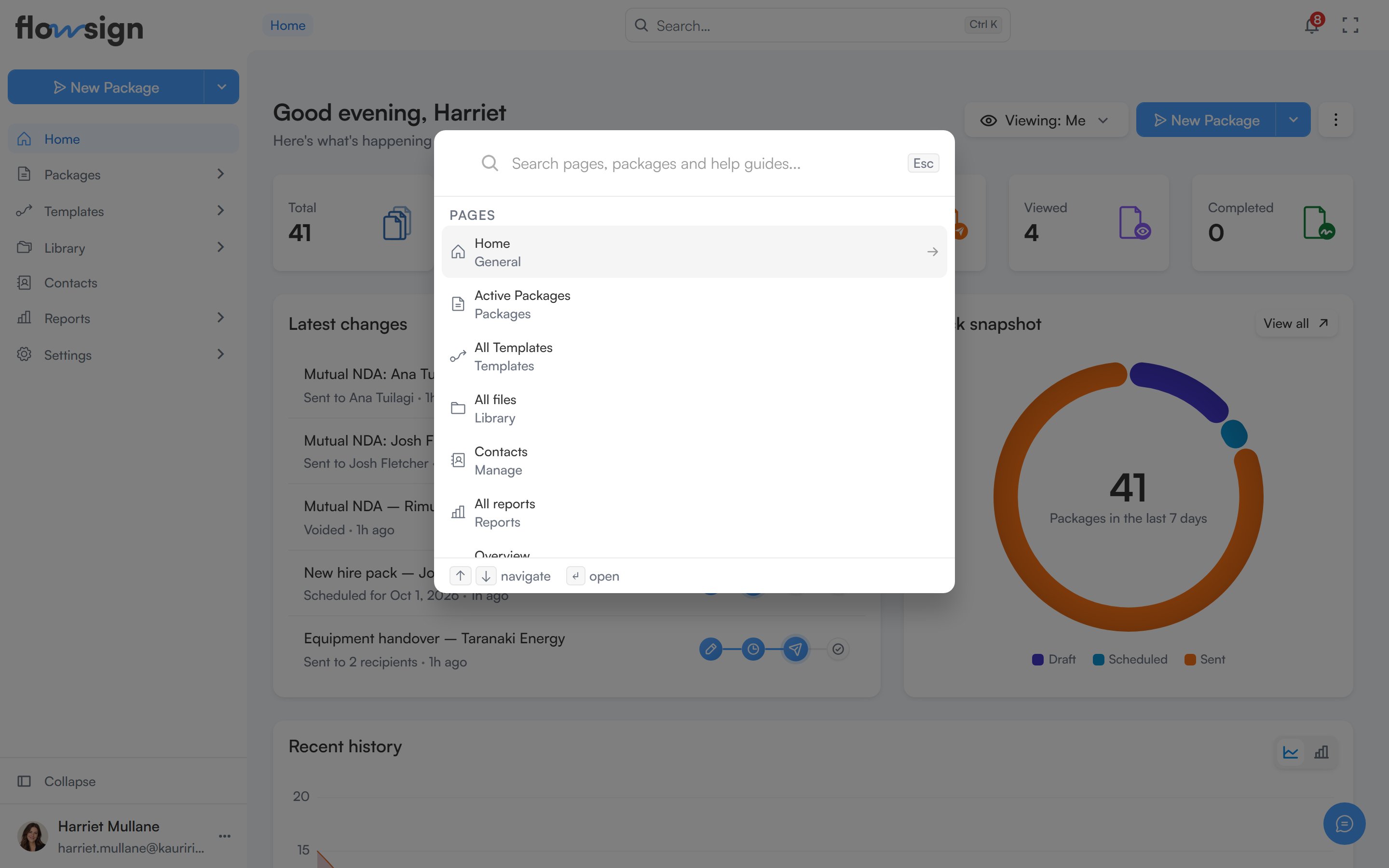
The command palette, open from the header search box.
Dashboard options menu
The kebab menu next to the greeting has three panels:- Adjust layout: switch the dashboard between Default and Compact density, and turn individual sections on or off: Status summary, Latest changes, Quick snapshot and Recent history. When Status summary is on, you can also choose which individual stat cards appear. Reset to default clears your customisations; Done closes the panel.
- Date range: choose Last 7 days, Last 30 days, Last 90 days, Last 12 months or All time, or Custom range… to pick specific dates. The chosen range applies to the status summary, quick snapshot and recent history.
- Refresh data: shows when the dashboard’s data last synced, and a Refresh now button.
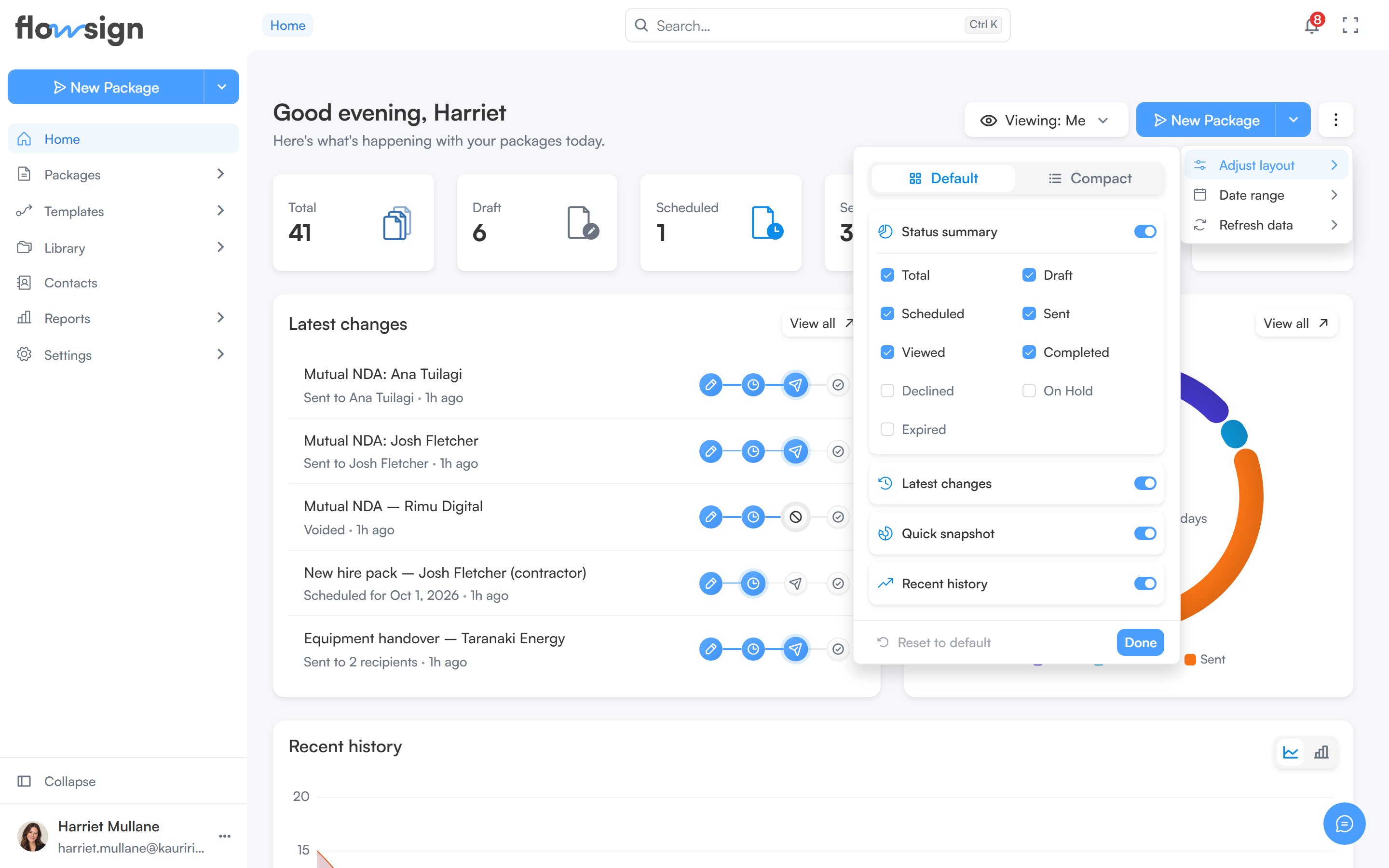
Adjust layout, switching sections and stat cards on and off.
Status summary
A row of stat cards summarising your packages for the selected date range: Total, Draft, Scheduled, Sent, Viewed, Completed, Declined, On Hold and Expired. Declined, On Hold and Expired are off until you turn them on in Adjust layout. Each card links through to the matching packages list. Draft opens Drafts, Sent opens Sent, and Expired and Total open the unfiltered Active packages list. The others open that list filtered to their status.Latest changes and quick snapshot
Two cards side by side:- Latest changes: your most recently updated packages, with a View all link through to Packages.
- Quick snapshot: the split of your packages by status for the selected date range, as a share of the total.
Recent history
A full-width chart of packages created, sent, signed and viewed over the selected date range, shown beneath the two cards above.If every section is switched off in Adjust layout, the page shows an empty state: Your dashboard is empty, with a hint to reopen Adjust layout.